Brand Identity · Concept Project
Precision Flight Systems
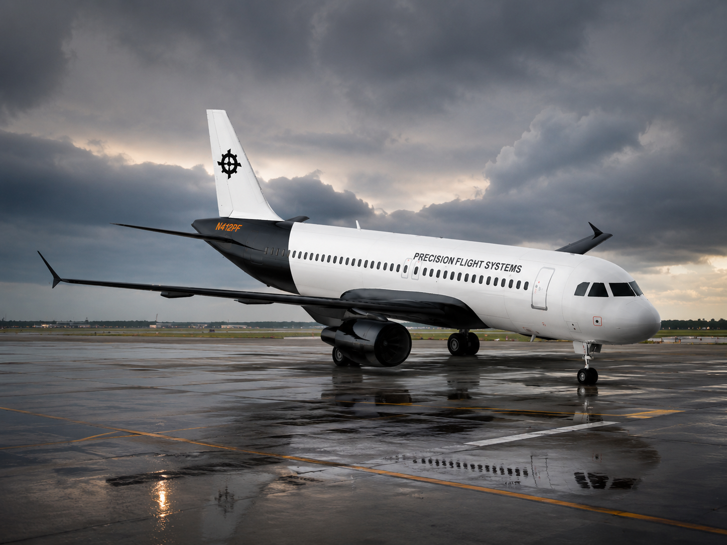
A self-directed brand identity and 40-page guidelines document for a fictional aircraft manufacturer, designed to give a precision-engineering company one consistent, credible voice across everything from the aircraft livery to the trade-show floor to the spec sheet.
The premise
I built this project around a fictional brief: Precision Flight Systems is a aircraft manufacturer whose brand hasn't kept pace with its engineering. I imagined a company whose logo exists in several unofficial versions, whose spec sheets are laid out ad hoc, and whose identity looks inconsistent across the aircraft, the website, and the trade-show booth. That is a real liability in a field where buyers equate visual rigor with engineering rigor.
Working from that premise, I set three goals for the design: unify the identity around a look that signals precision and reliability, make the brand feel credible to operators and procurement teams, and document the system clearly enough that staff and outside vendors could apply it without guesswork.
Development
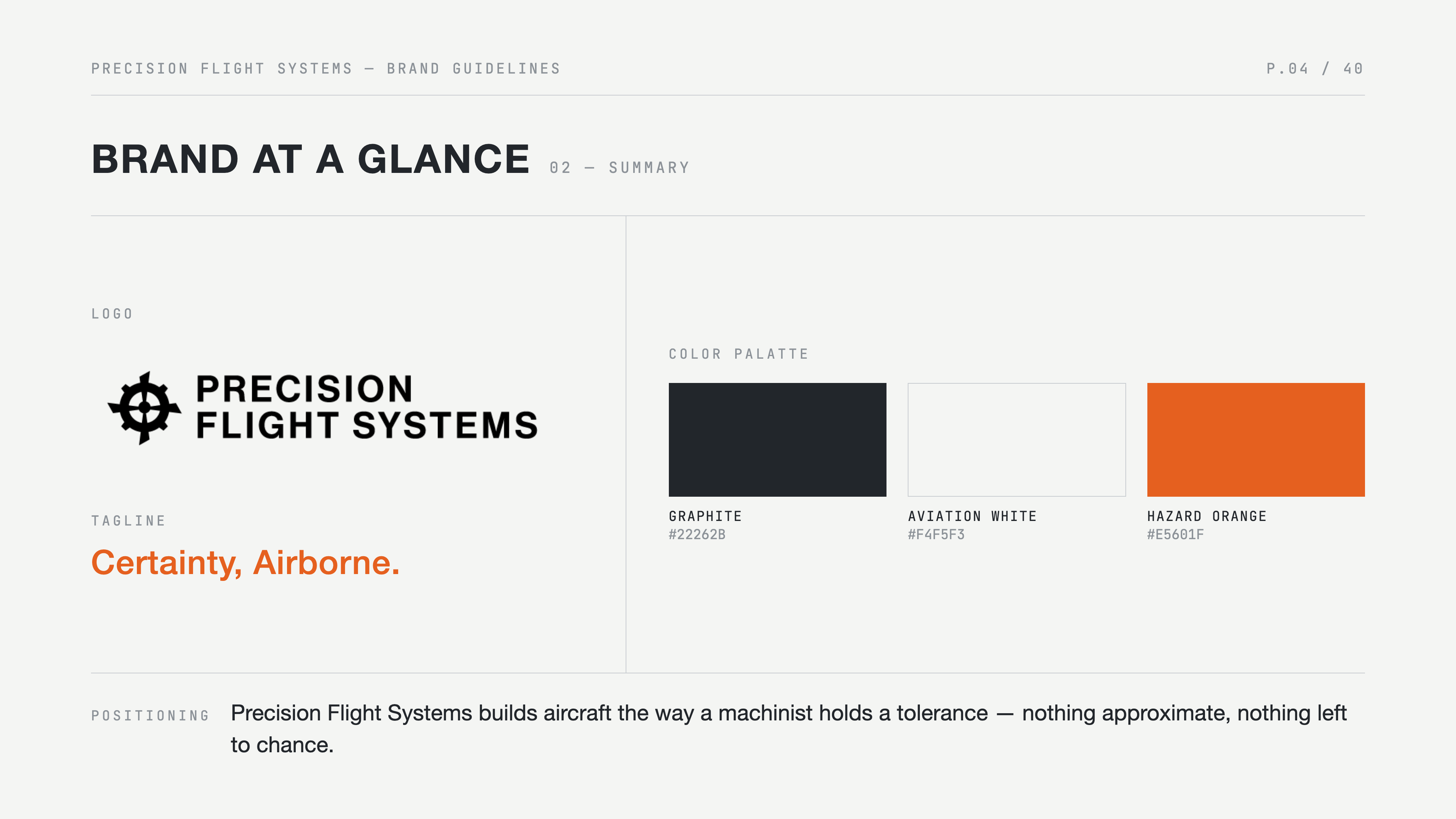
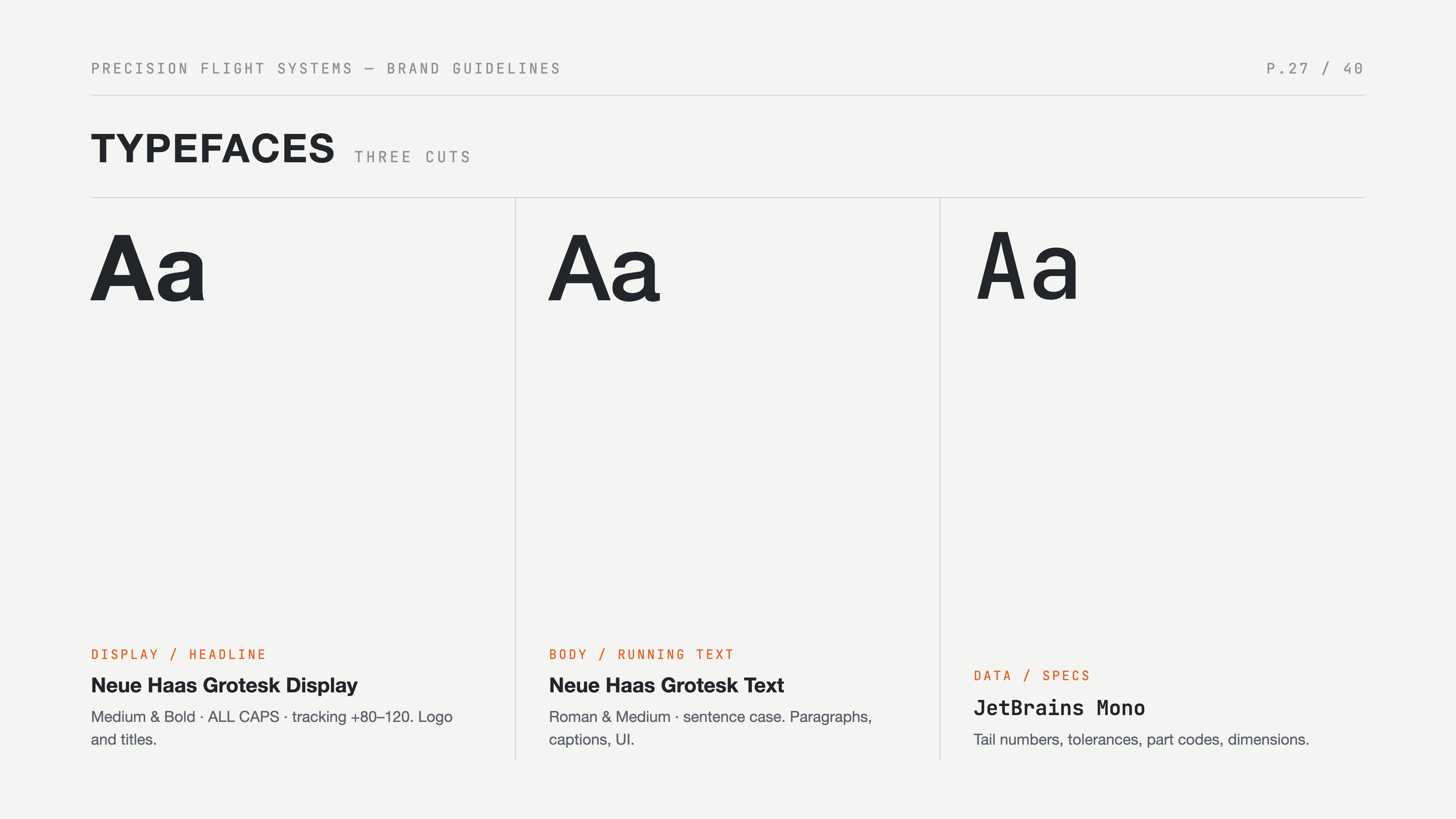
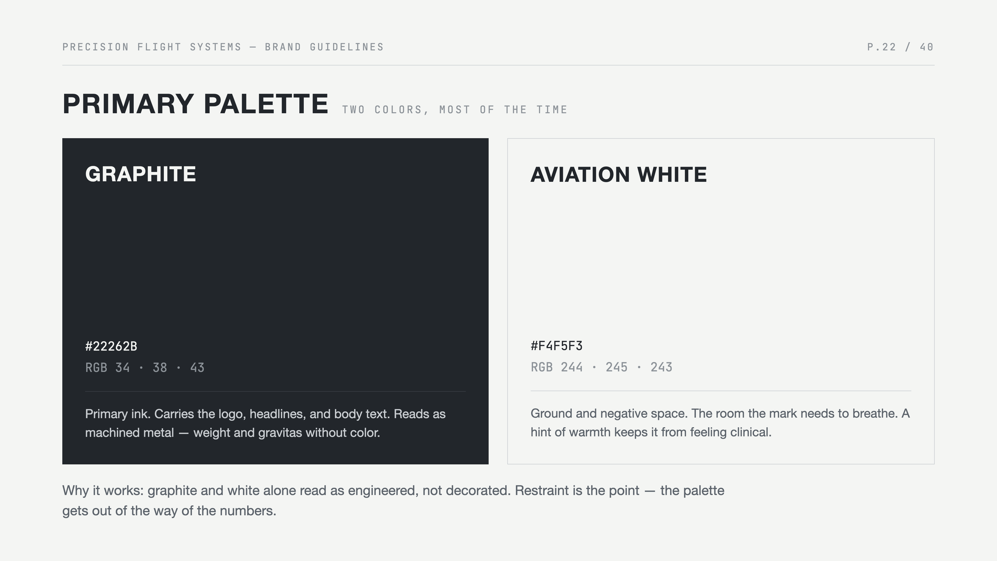
I started by mapping out every touchpoint a company like this would have, then explored two visual directions through moodboards and styleframes. I refined the stronger direction into a precise, engineered wordmark, a restrained palette anchored by a single confident accent, and a clean serif-and-sans type pairing built for both marketing and technical documentation.
Every decision was stress-tested against practical applications like aircraft livery, signage, spec sheets, and trade-show graphics before it earned a page in the guidelines.
The system
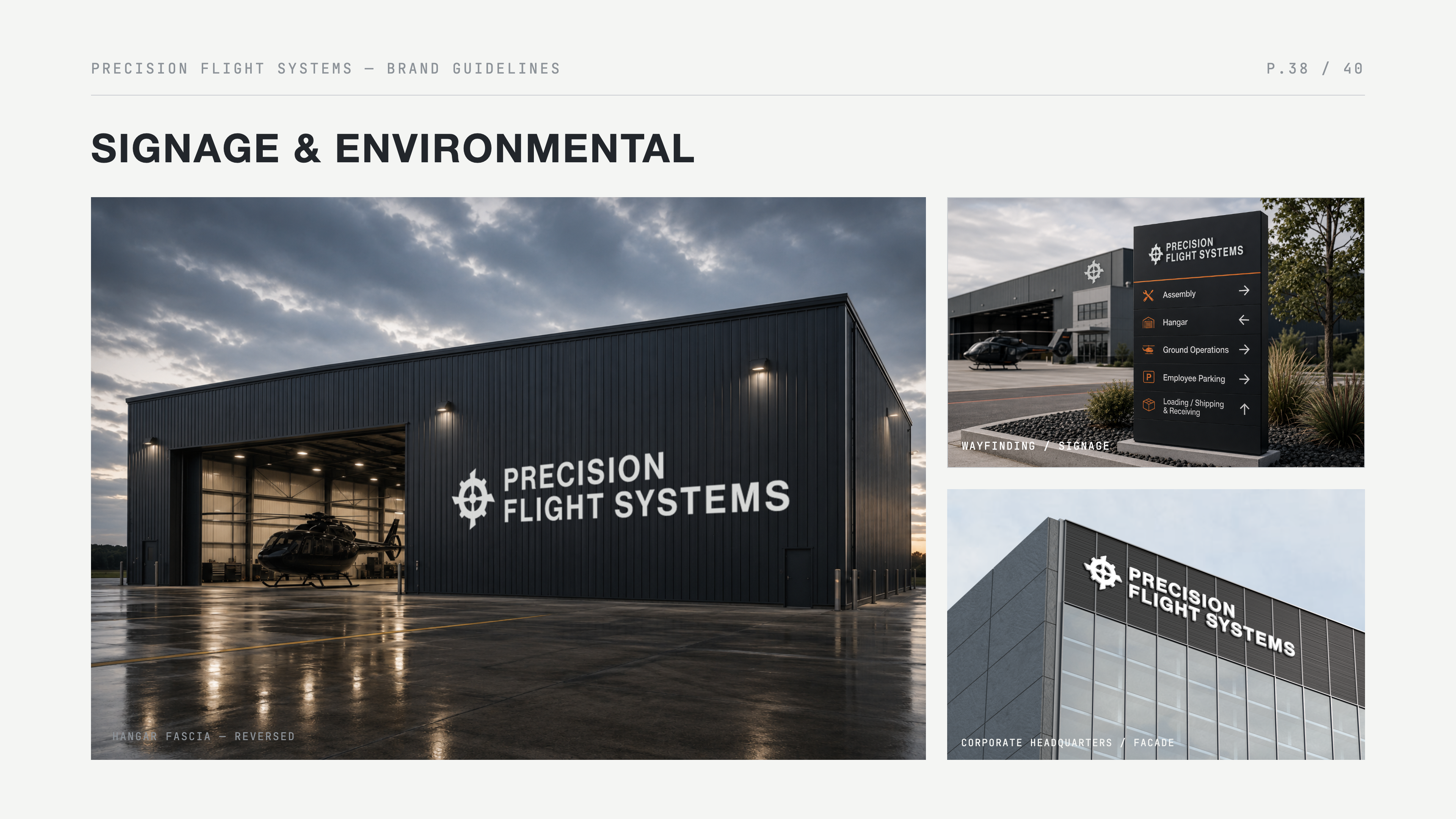
The centerpiece is a 40-page brand guidelines document covering logo usage, clear space, color, typography, photography style, and voice, plus an organized asset library, aircraft livery and signage applications, and ready-to-use templates for spec sheets and trade-show graphics. I designed the document to be self-explanatory, so a company could hand it to staff or outside vendors and get on-brand work back without a designer in the room.
The thinking behind it
I chose an aviation-manufacturing premise because it's a demanding test for an identity: the same system has to hold up on a spec sheet full of technical data, on the side of an aircraft, and on a trade-show wall, all while signaling the precision buyers expect. Designing for that range meant building a restrained, disciplined system rather than a decorative one, where every choice, from the engineered wordmark to the single accent color, works to make the brand read as credible and consistent across marketing and technical contexts alike.
The 40-page guidelines are the real deliverable of that thinking: a system documented clearly enough that anyone, whether internal staff or an outside vendor, could produce on-brand work from it without guesswork.